MKB mobility
A case study
Introduction
We were tasked to redesign a local service, which focuses on sustainable mobility in Malmö, Sweden. Our group were appointed with MKB’s cargo bike pool. A cargo bike pool is a shared resource within urban transportation systems, which offers a fleet of cargo bikes. They can be accessed through Mobility as a Service (MaaS) platforms. MKB Rönnen, the student housing where the user research took place offers affordable and convenient living spaces for students within close proximity to Malmö university and the city center. MKB deployed their cargobike service in collaboration with ThinkTrain in 2018 with ambitions of bringing affordable and sustainable mobility to its residents. With the goal to provide their residents with an eco-friendly transportation alternative to fossil power vehicles. All work presented in this case study is my contribution to the group project.
Service safari
Service safari is a design method that involves observing and analyzing the customer journey by experiencing it first hand. We would experience the service first hand by immersing ourselves in the user’s environment to gain a deep understanding of their experiences, needs, and pain points. The safari resulted in a customer journey, that shows the progression of using the service. Experiencing the service first hand was beneficial as it allowed us to get a more nuanced view over the service and the user experience, something that I will carry with me to future projects. By understanding the context of which the product and/or service coalesce we would uncover valuable insights that informed our design decisions down the line and created the foundation of our user research.
Survey
Residents at Rönnen were asked if they had ever used the cargobike service. The survey provided valuable insights into residents' experiences, perceptions, and expectations regarding the cargobike service at Rönnen. Through structured survey questions, the study obtained quantitative insights into the frequency of usage, satisfaction levels, and specific pain points associated with the cargobike service. This quantitative data provided clear metrics for evaluating the effectiveness and areas for improvement of the service. Insights into students' perceptions of the cargobike service can inform efforts to enhance the user experience and address any barriers that may be preventing them from utilizing the service. This could involve improvements to the registration process, app interface, or customer support services to make the service more accessible and appealing to students.
Interview
Contextual interviews, commonly used as a ethnographic method in service design involves observing and interacting with participants in their natural environment to understand their behaviors, needs, and motivations. This method allowed us to immerse ourselves in the users environment, providing valuable insights not easily observed elsewhere. Conducting interviews within their familiar surroundings, users could feel more at ease discussing their experiences and knowledge about the service. This helped reduce any initial tension that often arises during user interviews. A valuable insight that I personally got from this particular method was that users were generally more quick to come up with a response and could further elaborate on them, opposite to when I have conducted interviews that were “out of context” of what we were discussing. The user research revealed a mixed perception of the mobile bike sharing service among a diverse group of participants. While the service was generally praised for its convenience and environmental benefits, several pain points were identified, particularly regarding the initial registration process, the app’s language limitations, the lack of helmets.
Flow
User flows are visual representations of the steps a user takes to complete a task on a web or mobile application. They can help to identify potential usability problems by giving the designer a ”bird eye view” over the product. My method of choice in this case was an User flow, to get get an idea of how users might navigate the app. My goal was to minimize channel hopping and streamlining the sign up process.
Wireframe
I disregard best practices and design guidelines in the begining of my process, as I want to get my thoughts out as quick as possible. It is an iterative process for me so I will leave the detailed work for later when it is time to refine. My focus was primarily on the registartion process and onboarding as this was the main painpoint during our research. Removing the registation code altogher would improve the user flow. This would be possible by allowing residents to login with their BankId the same as on the website.
Test
I conducted a ”thinking aloud” usability test, guided by the Nielsen Norman Group’s (NNg) methodology. The participant was a classmate who did not have any prior knowledge about the project and would go through the user flow from being aware to completing a fictional booking process. This allowed me to observe how a potential user would think and act when using the mobile app.
Onboarding
To ensure that all first-time users understand how to use the mobile app effectively, an onboarding flow in English is presented upon their initial use. This helps address any concerns users may have about navigating and utilizing the app’s features. Following Apple's Human Interface Guidelines, I avoided adding too much information, as most users won't be able or willing to take it all in. I did not include a skip button but did add a progress bar to indicate their progress and signify the length of the onboarding process.
Home
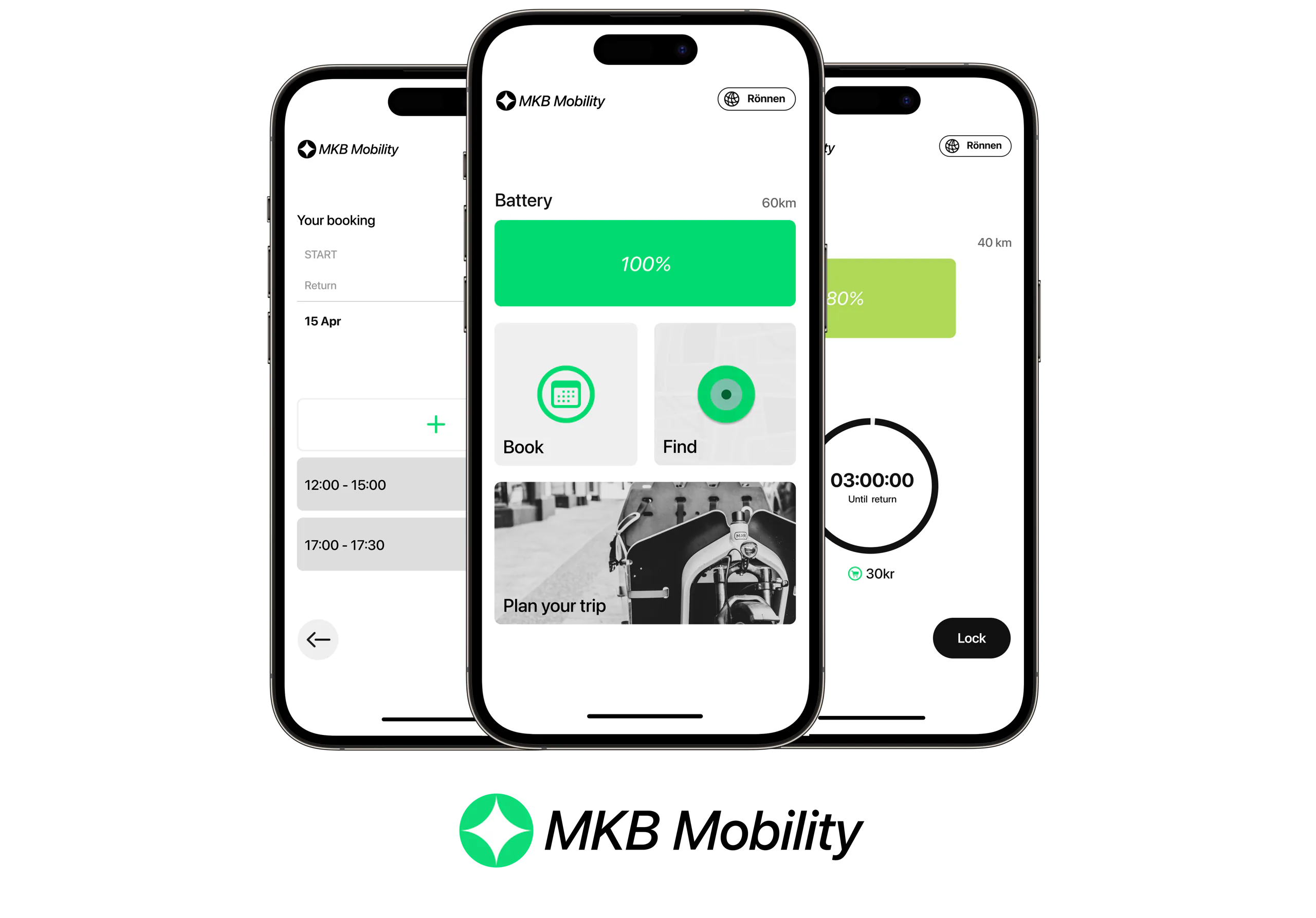
During our user research, we identified a significant pain point: users often found their bikes uncharged, negatively impacting their experience as they had to reschedule their trips. To address this issue, I prioritized making the bike's battery status the most prominent element on the home screen. By providing users with the current charge level at a glance, I aim to prevent unexpected disruptions and enhance their overall experience.
Rent
In the rent flow, I focused on placing the most crucial information at the top: the user's booked time. By organizing the information this way, the users can efficiently manage their bookings and access necessary details without unnecessary navigation.
Ride
Ride has three states the first is a countdown, before the ride begins, a countdown is displayed until the user can access the bike. Users are reminded of this countdown through push notifications, provided they have allowed them. Active Ride: During the service period, users have the ability to lock and unlock the bike at their convenience. This flexibility ensures they can take breaks or make stops as needed. When the user charges and locks the bike, they can complete their journey seamlessly. This final step ensures the bike is ready for the next user and helps maintain service efficiency.
Reflection
During our project, we encountered several challenges and areas for improvement that we plan to address moving forward. Firstly, the registration and access process for the service involved three separate touchpoints: MKB’s website, the help-desk, and the Tripley app. This multi-step process was cumbersome and could potentially deter users. In the future, we aim to streamline this experience by brainstorming solutions that would consolidate these steps into a single, more efficient channel, making the process easier and more user-friendly. Secondly, as a multicultural group, we faced a language barrier since not all team members spoke Swedish, and the service did not offer an option in English. This lack of multilingual support is a significant oversight, as it could potentially exclude international students and non-Swedish speakers. Ensuring that the service is accessible in multiple languages, particularly English, is crucial for inclusivity and broad user adoption. Addressing this issue will be a top priority as we move forward. Additionally, we found that users did not clearly understand the value of the service. Many were unsure of how they would use it, and the involvement of a third-party app introduced confusion about responsibility in the event of an accident. This lack of clarity likely contributed to a lack of engagement with the service. Moving forward, we plan to refine the service’s communication and user interface to make its purpose and benefits more evident, and to clarify the roles and responsibilities of all parties involved. To enhance the overall experience, we also plan to brainstorm ideas for improving the security of the garage where the cargo bike is stored. Ensuring that users feel confident in the safety of their equipment is essential. In addition, we will work on redesigning the app to centralize all necessary information in one place, with a focus on providing clear instructions and guidance in English. Finally, to incentivize users and increase engagement, we intend to add guides on fun activities that can be done using the service and to work on branding the service in a way that resonates more with our target audience. By making these changes, we hope to create a more accessible, valuable, and user-friendly service.