FysioFresh: Appointment Management v2
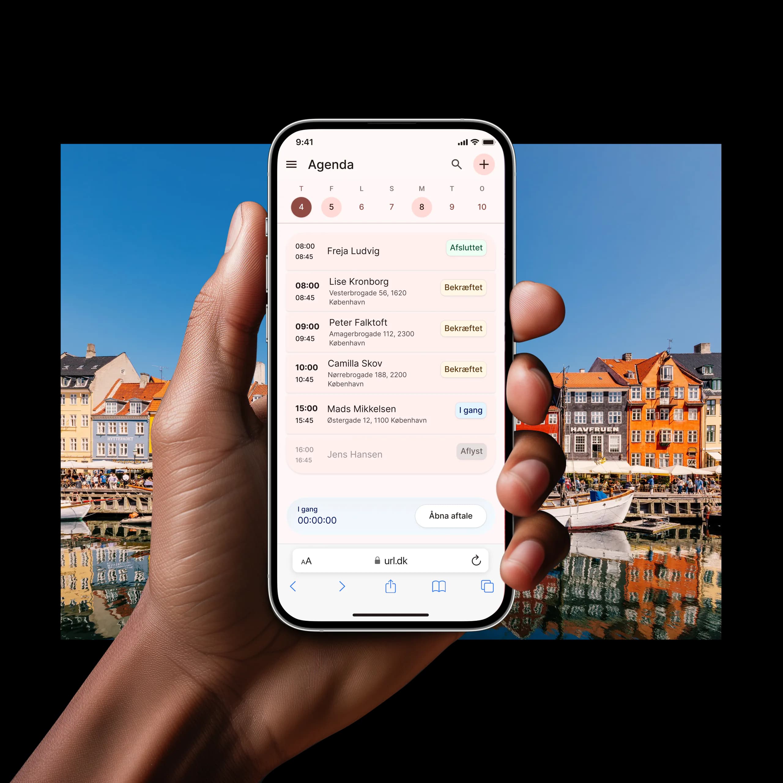
Bringing the right schedule context into the booking flow to eliminate back-and-forth, improve performance, and make conflicts predictable.
Role
Product Designer
Timeline
Dec 2025- Feb 2026
Team
5
Introduction
This product lives in an unusually high-stakes moment: therapists often book follow-up sessions while sitting with their patient. In that context, the old experience created a trust problem. Therapists avoided looking at their phone for too long, forward planning was rare—few appointments were booked four or more weeks out—which hurt treatment continuity and made staffing and capacity planning harder for admins. Booking multi-week plans meant constant context switching because the Create flow lacked schedule visibility, and the Calendar was slow to load.
Challenges
How might we enable therapists to confidently plan multi-week treatment programs during patient visits—without guessing availability, losing track of travel time, or switching between screens?
Contextual Inquiry
I joined two home visits because this workflow is highly dependent on environment, time pressure, and social dynamics—patient present, therapist standing, phone in hand. Lab testing wouldn't show the real constraint: the cost of attention. Three recurring behaviors changed how we framed the solution. First, therapists plan in programs, not single appointments—they think '6 weeks, Tuesdays at 14:00' but the product forced a one-booking-at-a-time mental model. Second, they check the schedule to plan around travel time, not just availability. Third, they don't browse far ahead in the calendar until booking demands it—PostHog heatmaps showed most interaction clustered around today plus the next few days.
Alignment
The team had competing needs. Therapists needed speed and confidence on mobile. Admins needed overview, cancellations, utilization, and forecasting. Engineering faced real performance constraints: the calendar view fetched too much data and switching views was expensive. To prevent the project from turning into a calendar redesign by committee, we aligned on a measurable behavior change and its operational drivers.
Shared Success Criteria
Our primary metric was increasing appointments booked four or more weeks in advance, with weeks two through six trending upward. Secondary operational metrics included fewer context switches between Create Appointment and Calendar per booking session, and reduced time-to-book for multi-appointment creation.
Decision Framing
We used a compressed GIST-style checklist to keep discussion anchored: What user problem are we solving? Who's impacted? Consequences for flow, engineering risk, and safety/accessibility. A quick sketch plus sanity check, followed by a short doc to lock the decision and build work from. The output made tradeoffs explicit and helped engineering invest in the right performance changes.
Split the Product by Role
The original UI assumed one schedule experience could serve everyone, but the goals are fundamentally different. Admins on desktop need appointment counts, cancellations, coverage gaps, and utilization four weeks out. Employees on mobile need to know who they see today, where they go next, and how tight their commute is. A unified view forced employees to pay an admin tax in density and complexity. We kept shared components but allowed role-specific compositions. The cost was some duplication; the benefit was drastically lower cognitive load and faster task completion for each role.
Visibility vs Performance
Stakeholders understandably asked for a full month view in Create. But loading large time ranges on mobile was already slow. In scheduling tools, performance isn't a nice-to-have—slow transitions become behavioral friction and people stop planning ahead. Instead of loading more, we loaded smarter: for the employee agenda, we moved toward day-scoped data. For planning multi-week programs, we embedded forward visibility only where it mattered—in the Create flow, scoped to the timeframe being booked. This unlocked speed and better planning without the performance penalty of a heavy universal calendar.
Schedule Context in the Create Flow
Therapists were toggling Create and Calendar repeatedly because Create had no forward visibility. Every switch cost time and attention, and the calendar load time amplified the pain. The design principle: don't make users memorize availability—put context where decisions happen. A therapist could now create follow-ups while seeing the agenda context needed for travel and conflicts. Booking became one continuous decision flow, not a navigation exercise.
Predictable and Recoverable Conflicts
Recurring flows often fail in two bad ways: force users to resolve every conflict up front (slow, brittle) or silently skip items (fast, untrustworthy). Therapists needed speed but also needed to trust what the system did. The flow optimized for transparency—showing what will be created versus skipped and why—recoverability, allowing users to reschedule skipped items later without restarting the entire plan, and proactive conflict prevention. This reduced the create-discover-cancel-rebuild loop that was driving 30-minute booking sessions.
Action Hierarchy
As the workflow matured, the interface accumulated actions: edit series, skip occurrences, cancel, confirm. When you're standing in a hallway between visits, opposing actions side-by-side is an error factory. We kept one primary action per screen with high emphasis and moved optional actions into an overflow menu to preserve the happy path and scale the UI safely. This is the kind of decision that prevents costly operational mistakes in healthcare workflows.
Telemetry-Driven Iteration
PostHog heatmaps showed a blunt truth: users rarely scrolled beyond the next few days in the calendar view. So we removed infinite future browsing behaviors we were paying performance cost for and refactored to fetch only what the employee agenda actually needed day-by-day, improving responsiveness without sacrificing task success. After feedback and testing, we added travel-aware cues, tightened compact layout for small devices, removed under-used features, eliminated misleading cancellation feedback patterns, and improved the single appointment flow speed with auto-close behaviors contributing to roughly 40% faster per-appointment booking.
Outcome
Multi-appointment booking time went from roughly 30 minutes to 2.5 minutes—91% faster—driven by fewer context switches, faster loading, and predictable multi-week creation. Appointments booked four or more weeks in advance increased with an upward trend in weeks two through six after rollout. Operationally, there were fewer Create-to-Calendar switches per session, lower calendar load burden by scoping data fetching, and reduced confusion from misleading states and conflicting actions. The biggest win wasn't only speed—it was confidence. Therapists no longer needed to hope the recurring flow did the right thing, and the booking moment became less socially awkward in front of patients.
Reflection
Field context exposes the real cost function—the pain wasn't only extra taps, it was attention in front of a patient, and that changes what good looks like. Preview beats visibility: users don't always need the whole calendar, they need a trustworthy preview of the decision they're making right now. Performance is UX, especially in operational tools—a slow calendar doesn't just feel bad, it changes behavior. Role clarity reduces complexity more than UI polish: splitting by role was a system decision that simplified everything else. And designing recoverability is how you earn trust—healthcare workflows have exceptions, and the interface has to acknowledge reality and provide graceful ways back.