Appointment Management at Fysiofresh v1
Streamlining appointment workflows for both admin and therapists with robust, scalable, and accessible UX.
Role
Design Engineer & Project Manager
Timeline
April 02 - June 04
Team
3
Introduction
Fysiofresh's MVP scheduling system was error-prone and unscalable. I led the end-to-end redesign to build a robust, user-centered platform. The goal: clarity for admins, mobility for therapists, and long-term scalability. Through user research, stakeholder alignment, rapid prototyping, and tight dev collaboration, we delivered a tool that improved both speed and satisfaction.
Challenges
How might we reduce friction in complex appointment scheduling and support both administrative staff and mobile therapists?
Design Goals
An MVP had already been created before I stepped in with the basic functionalities, my task was to take over from here and re-design it end-to-end doing a full double diamoind iteraiton. Me and our stakeholders aimed for robustness, transparency, clarity, and an optimized desktop interface to enhance reliability, visibility, and efficiency in appointment scheduling.
Design Process
The UX process was a structured, collaborative journey across five phases: Discover, Define, Design, Validate, and Ready for Development. It began with researching the problem, gathering insights, and aligning on user and business needs. Next, we defined the problem, synthesized findings, mapped user flows, and ran scoping workshops to prioritize features. During the design phase, we created mockups and interactive prototypes aligned with Material Design, Vuetify, and internal style guides. These were then validated through usability testing, and refined based on user feedback. Finally, we prepared for development with a rollout plan, issue tracking in Linear, and a thorough handoff to developers. Each phase included documented outputs in Outline and cross-functional reviews to ensure clarity and quality.
Competitor analysis
To gain comprehensive insights for our calendar design, I conducted a thorough competitive analysis examining diverse calendar solutions. I began by studying Notion calendar's sleek interface and seamless integration capabilities, followed by analyzing iOS Calendar's intuitive navigation and clean visual hierarchy. My research extended to Google Calendar's robust feature set and accessibility options, as well as Microsoft Outlook's business-oriented scheduling tools. I also investigated Calendly's streamlined appointment booking workflow for efficiency insights. To ensure relevance to our specific context, I evaluated several industry-specific healthcare scheduling platforms, focusing on specialized features particularly relevant to physiotherapy practices. This multi-faceted analysis provided valuable benchmarks and innovative approaches that informed our design decisions throughout the project.
Existing System
Using the current version of the system as a starting point, we mapped the end-to-end user flow and identified key friction points through user testing and stakeholder conversations. Interviews and workshops with administrators and therapists revealed several core challenges: administrative inefficiencies caused by manual data entry and unclear interface elements; poor transparency due to limited visibility into appointment changes and cancellations; scalability issues that made it difficult to manage high volumes of appointments; and mobile usability problems that highlighted the need for a more responsive and streamlined experience on smaller devices.
Appointment Creation Flow
We replaced unstable modal interactions with consistent, standalone forms to improve reliability and user focus. Direct calendar interactions were introduced to streamline appointment booking, allowing users to act faster with fewer steps. We also implemented automatic estimation of distance and travel times to support better scheduling decisions. A detailed user flow diagram helped form a shared mental model of how the feature is structured, revealing the full lifecycle of appointments and user interactions on the platform. This clarity enabled us to identify the most frequent user actions and emphasize them in the design to enhance efficiency and reduce friction.
Transparency
The design process initially went down the rabbit hole of contextual tooltips, aiming to clearly explain disabled actions, along with comprehensive timelines detailing appointment histories and cancellation reasons. However, after speaking with users, it became apparent that these elements should not be overly prominent. Users preferred that such details fade into the background or be optionally filtered out entirely. Moving forward, we fine-tuned the design to make these elements more subtle and non-intrusive, aligning better with real user needs.
Updated UI & Interactions
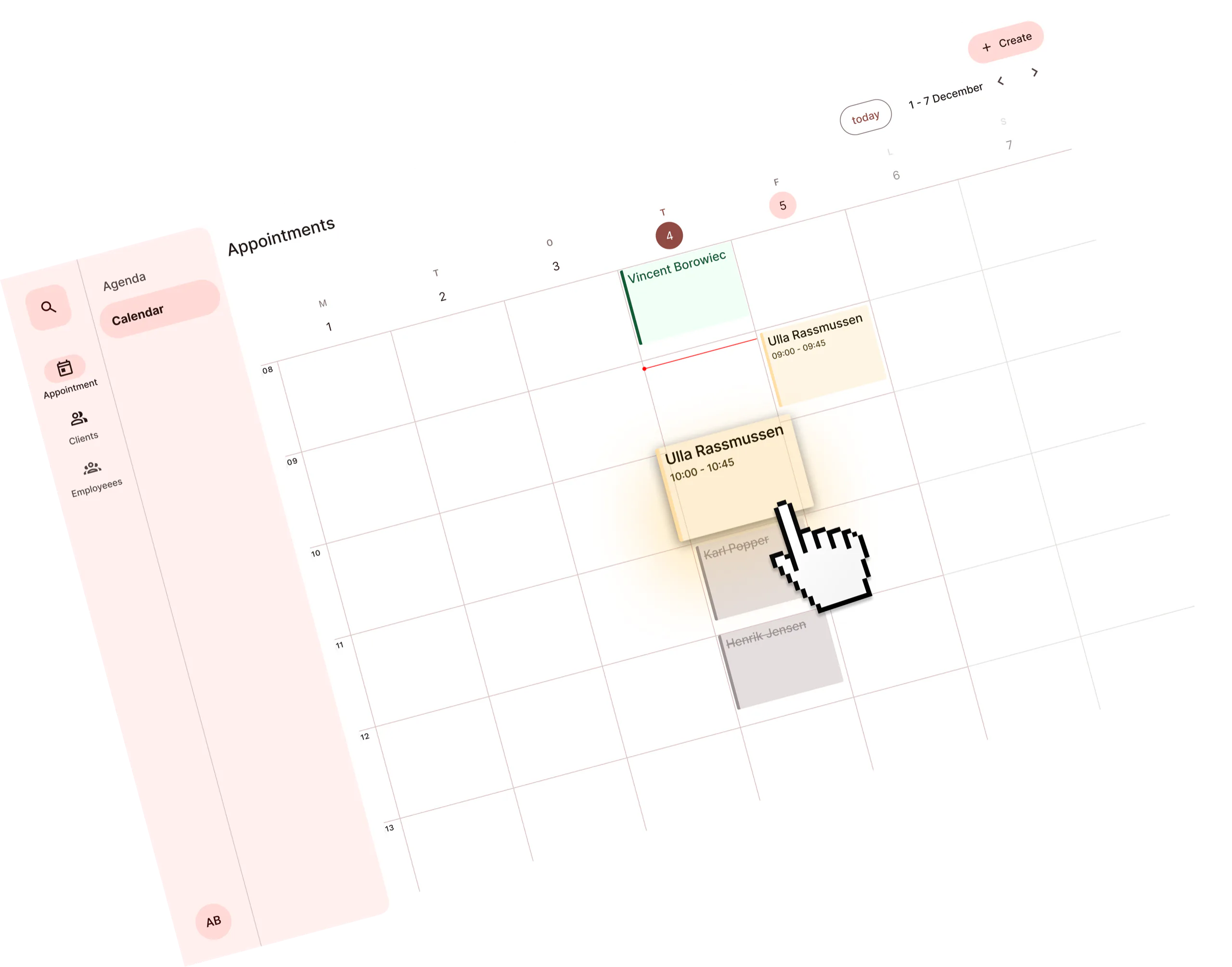
To address usability challenges surfaced in interviews, we introduced clear visual differentiation for booking states using color-coding and iconography—moving away from the previous design where all bookings shared the same default appearance. Users emphasized that different appointment types carry varying degrees of importance depending on treatment type and status (e.g., completed, canceled, or upcoming), making visual clarity essential. We also added sticky headers for easier weekly navigation and optimized the desktop layout to better support power users—primarily administrators—who manage large volumes of appointments and client schedules. Their workflows often involve filtering and making bookings in a dense interface, so reducing visual clutter was critical. Meanwhile, therapists primarily use the calendar to plan their day via mobile, which would be explored further in the next phase of the process.
Second iteration of calendar cards
Both canceled and completed appointments were intentionally given less visual emphasis, as users indicated these were no longer critical to perceive at a glance. To reflect this, we introduced a distinct “disabled” visual state for such events. At the same time, appointment cards were enhanced with color differentiation and icons to clearly indicate the type of treatment or session—acknowledging that different appointment types come with specific requirements and expectations. This helped users quickly assess the nature and relevance of each booking without unnecessary cognitive load.
Filter Options
The introduction of a filtering system—absent in the initial version—quickly improved the administrators' workflow by allowing them to easily toggle and hide extraneous information. This significantly reduced cognitive overload and helped them focus on the most relevant bookings during high-volume scheduling.
Mobile
After prioritizing the admin workflow, we shifted focus to the therapists—many of whom access the schedule on their mobile devices while biking between clients to plan their day. We redesigned the calendar view specifically for mobile, introducing intuitive horizontal and vertical scrolling to support quick, on-the-go navigation. Mobile interactions were simplified to align with therapists’ real-world workflows. A key outcome of this process was the implementation of a scrollable container displaying two days at a time, allowing more data-dense event cards to fit comfortably on screen. Users could toggle to a full workweek view if needed, but the two-day view was set as the default, removing unnecessary clutter such as weekends, which therapists rarely used in their scheduling.
Iterations & Prototypes
I produced multiple tangible, Vue-based prototypes to clearly communicate interaction patterns to both stakeholders and developers. These prototypes played a key role in enhancing shared understanding and enabling fast, focused feedback loops. The first step was to familiarize myself with the core libraries—primarily FullCalendar.io—followed by iterative testing of various configurations to refine the interaction design and validate feasibility within the technical constraints.
Usability Testing & Refinements
Internal usability testing served as a critical quality assurance phase that identified and systematically resolved several key issues affecting the user experience. The testing process revealed layout and margin inconsistencies that were creating visual discord across different interface elements, which were subsequently fixed to ensure a more cohesive and professional appearance. Additionally, the team standardized icon usage across all interfaces, eliminating confusion and creating a more intuitive visual language that users could easily understand and navigate. Finally, the testing phase led to significant enhancements in both responsiveness and interaction quality, ensuring that the interface performs smoothly across different devices and provides users with fluid, engaging interactions that meet modern usability standards.
Project Management Approach
Structured tasks clearly in Linear, aligning UX objectives closely with software development capabilities. Regular stakeholder engagement ensured iterative improvements matched user needs and business goals.
Results
This holistic UX approach successfully addressed both user and business goals, showcasing the transformative impact of integrated design and project management strategies in healthcare technology. The project leveraged a comprehensive toolkit including Vuetify, Material Design 3, and Figma for creating scalable design components, while utilizing Linear for streamlined task management and efficient team collaboration. The implementation delivered significant improvements across multiple dimensions, enhancing the clarity and robustness of scheduling interactions to make appointment booking more intuitive for patients, increasing administrative efficiency and therapist productivity through streamlined workflows, and establishing scalable UX solutions that position the platform for sustainable future growth. This comprehensive approach significantly reduced friction in appointment management processes, creating a more seamless experience that greatly improved user satisfaction while simultaneously boosting operational efficiency for healthcare providers.
Reflection
Our results reinforced that being disciplined and properly scoping the project keep momentum high without unnecessary bloat, and treating documentation as an accelerator aligned the team faster. We also learned that selective removal—such as pausing dark mode—can be as impactful as adding features. Finally, co-ownership between design and engineering turns good work into a durable system that scales. Furthermore, close collaboration with engineering—especially around the Vuetify config—sharpened our shared mental model. Figma libraries and config files are two interfaces to the same system of decisions. Treating them that way reduced back-and-forth and centered our conversations on intent and outcomes. The design system is now more than a component set; it’s a bridge that supports trust, empathy, and shared responsibility across disciplines.
Written in collaboration with ChatGPT-4.5